


GO FIGURE: Tips for Data Presentation: Effective Figures (and Tables)
A picture is worth 1,000 words after all! Learn some quick skills in data presentation, figure creation, and Results section writing (FREE WEBINAR!)
ALL WELCOME to join our NEXT FREE WEBINAR NEXT THURSDAY AT 12.00 GMT

Some of our Top Tips for Figures: Bentham Science Publishers & SciTrain
A picture is worth a thousand words, as the old saying goes: this is certainly true in academic papers. How can you ensure that the figures and images you use in your writing are as effective as possible at communicating your message? Here are a few suggestions that you might like to have a think about the next time you put together a paper for publication.
And here is the paper:
The first, and perhaps most important, rule is: know your audience. Are you writing a paper for a general audience, perhaps for a high-profile, cross-cutting journal, or are you writing a paper that will only be read by specialists in your field. The figures in each case will be different purely because generalist readers will likely need more of an introduction to the work you are doing. This is well worth thinking about before starting to design your figures.
With this in mind, the second key rule when putting figures together is to identify your message: What are the main things that you want someone looking at the figure to take away at a glance. The significance of your results, the location of a field site, a method used for data collection? Focus on this when creating the image. Also, remember, your figures should be easy to understand and follow without reading the caption: you can put more information, of course, into your figure captions but images have to be understandable, standalone entities. People very often download figures from journal websites distinct from the main paper, so these have to be clear and easy to understand. Have a look at some papers recently published in your field that have nice looking figures to get some ideas: keep text to a minimum but large in size, make sure you clearly label things that you want your reader to understand (axes on graphs, for example), add scale bars to maps and images where necessary, and choose colours that work with one another. Black and white, or black and red work well together, while yellow and green, yellow and red are less good matches.
Another top tip is to find a piece of drawing software for making figures that you are happy with and find easy to use. Don’t struggle with professional graphics packages when something simple (perhaps a package already installed on your computer) will work just as well. You have to be happy and confident about your figures and they have to be easily editable in case you need to move your formatting between two journal styles, perhaps after rejection, for example.
Try not to include junk in your images; graphs and charts can be simplified, for example, so that your main message is easily visible, or labelled (with an arrow, or asterisk). Too many lines or unnecessary curves are confusing for the reader, but, at the same time, don’t mislead readers. It’s important to always present your data, as collected, in a fair and impartial way. You’re not allowed to ‘massage’ your data to reach the result you want!
Research on effective communication suggests that use of black backgrounds for figures (if allowed by your target journal style guide) is more effective than white. Letters, usually white, on a black background has been shown to be the most efficient way to draw a reader into a figure and capture their attention. The same goes for PowerPoint presentations; white backgrounds, although very common and widely used, are actually more distracting for viewers and pull their attention away from the contents. Most journal styles encourage either black or white backgrounds, but if given the choice try to opt for the former.
Figures as Results
The Results section of a clinical paper is often the part we complete first: After experiments and treatments are concluded, you’ll go ahead and make data tables, analyze for trends, and develop figures and graphs. You might not end up using all this content in your paper, but this is often the process researchers go through.

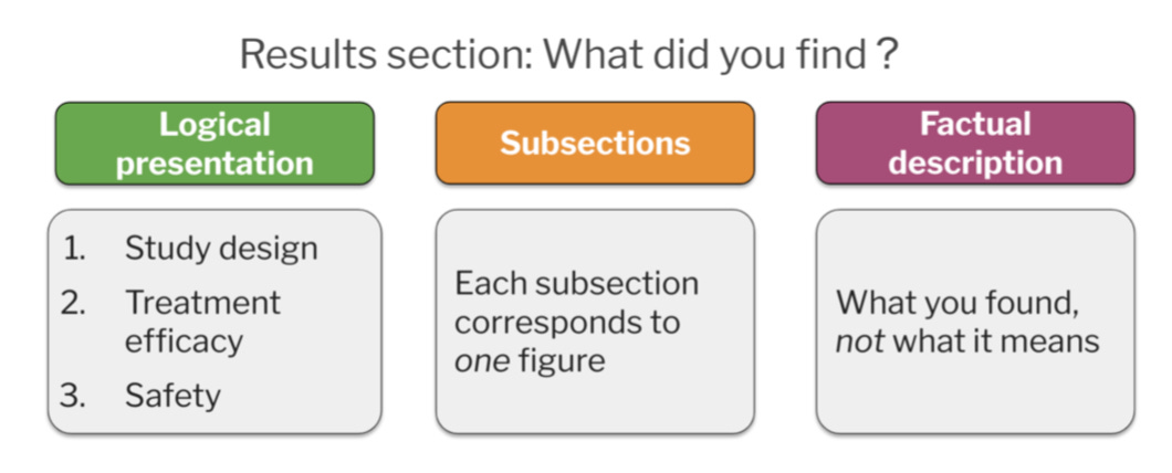
Your Results section should stick to the facts. The facts and nothing but the facts. Here, you present the outcomes of your experiments and treatments, logically guiding readers through the main findings of your research. Remember: You are very familiar with your findings, but your readers are not. Try to avoid cognitive bias where we assume that our readers are at the same level in a particular field as us. You are the expert. Probably no-one else in the world knows as much as you do about your research; you’ll need to explain things to your readers.
This is done by guiding readers one figure at a time through the Results section. Use your figures to explain the outcomes of your research. So, one figure = one result. You can do this by providing a clear subheading for each and referring to figures. Paragraphs can then be set up so you introduce an experiment, discuss the data you obtained, and then summarize key findings. The repeat this formula for the next outcome or experiment. Figures can be paneled or parts of other larger presentations (of course), but this basic structural approach works well as a way of clearly explaining in this section.
It’s also important to avoid some of the most common mistakes researchers tend to make when writing Results sections. The most common of these is the duplication of data between figures and text. Once you present data in a figure, you don’t need to repeat that outcome in the main text. Highlight important trends in the figures and tables; here you factually present data and analyses to your readers, while in the main text of the paper you describe trends and patterns that you want readers to appreciate. No interpretation though, this comes later, in the next section (Discussion).
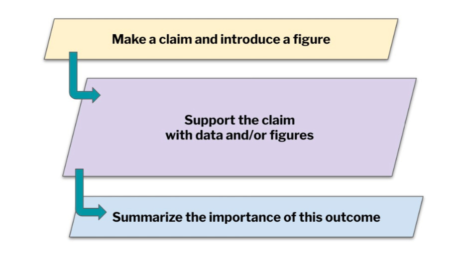
Here’s an easy-to-use paragraph structure for the Results section of a clinical paper that maintains logical flow from one part to another. Start by introducing a claim via a figure, or figure subpart and then support that claim with data (also in the figure), then summarize the importance of that component of the research. You can also use keywords to guide readers through your findings in this section. A rationale followed by what was done, then key trends, relevance, and importance for each key result (each figure). Introduce a figure, add supporting data, and then summarize the importance of this outcome. This approach works well, also to keep the word count down to a minimum (something that journals will also appreciate).
Here is another GREAT resource, published by our friends at Edanz.


